K12Press is your go-to resource for making the most out of your educational website. In this video guide, we delve into the transformative power of adding images and icons to your school’s website menus. This visual enhancement not only enriches the aesthetic appeal of your site but significantly improves user navigation and interaction.
The Power of Visual Menus
Navigation is the cornerstone of any website. It guides your visitors through your site’s content, leading them to the information they seek. By incorporating images and icons into your WordPress menus, you’re not only elevating the design but also making navigation more intuitive. Visual cues can quickly direct students, parents, and staff to essential pages, such as the school calendar, newsletters, or specific departments.
Tutorial Highlights
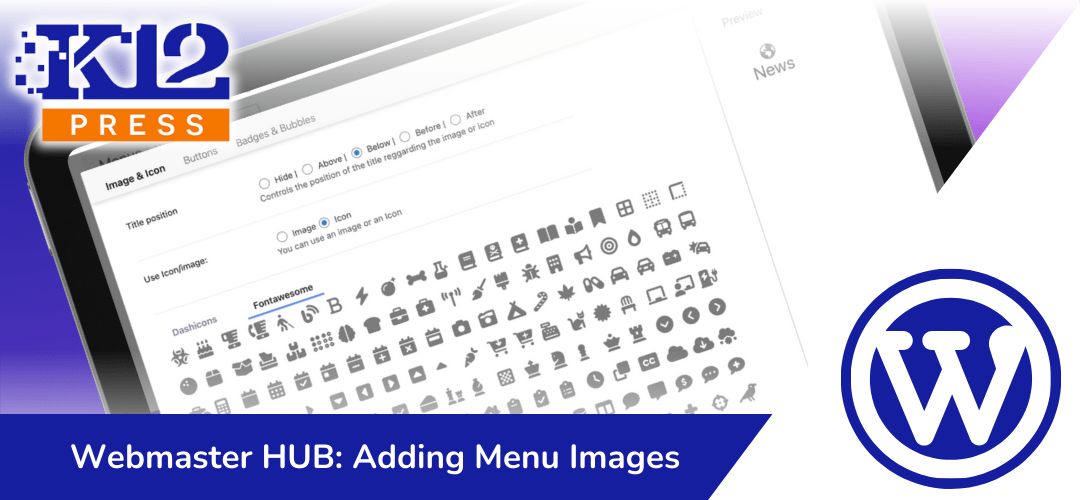
In our comprehensive YouTube tutorial, K12Press Tutorial: Adding Menu Images, we demonstrate the seamless process of integrating Menu Image & FontAwesome plugins into your WordPress site—both of which are readily available in the K12Press Plugin Library. We cover every step necessary to:
- Add and customize menu images and icons for enhanced visual appeal.
- Style those menu items within the Divi Menu Module to match your school’s branding and website design.
This tutorial is designed with all skill levels in mind, ensuring that even those with minimal technical background can follow along and apply these changes to their school websites.
Why Visual Menus Matter
The inclusion of images and icons in menus is more than a design choice; it’s about creating an engaging and accessible digital environment for your educational community. Visual menus can:
- Highlight critical information and events.
- Provide an immediate understanding of menu items.
- Reflect your school’s culture and spirit through customized imagery.
Your Next Steps
We invite you to watch the tutorial and see firsthand the impact visual menus can have on your school’s website. Whether you’re looking to refresh your site’s look or improve its usability, this guide has everything you need to get started.
Stay tuned to K12Press for more insights, tutorials, and resources tailored specifically to educational websites. Our mission is to empower schools to create dynamic, engaging, and user-friendly digital spaces that serve the needs of their communities.
Visit K12Press for additional resources, themes, and plugins designed with education in mind.
Step by Step | Creating Engaging WordPress Menus by Adding Images and Icons
Step 1: Introduction to the Plugins
- FontAwesome: Offers a vast library of icons for various applications, making it an essential tool for adding recognizable symbols to your menus.
- Menu Image: Enables the addition of custom images to your menu items, providing a visual representation that complements your site’s design.
Step 2: Accessing the Menu Section
- Navigate to your WordPress dashboard.
- Hover over the site name in the admin bar and click on ‘Menus’ to enter the menu editing section.
Step 3: Editing Your Header Menu
- In the ‘Menus’ section, select the header menu you wish to edit. This tutorial focuses on the XYZ Academy demo site’s top navigation system, showcasing how icons are added to frequently visited links like the homepage, news, and calendar.
Step 4: Adding Images and Icons
- Expand a menu item to reveal the option to add a menu image or icon.
- Ensure the Menu Image plugin is active; otherwise, the option to add images or icons won’t appear.
- Choose between uploading a custom image or selecting an icon from FontAwesome’s extensive library.
Step 5: Customizing Menu Items
- For each menu item, you can decide the placement of the title in relation to the image or icon (e.g., above, below, before, after, or hide the title).
- Select the desired icon from FontAwesome’s library, considering whether you want a solid, regular, or brand icon.
Step 6: Saving Your Changes
- Once you’ve added and positioned your images or icons, save your changes to the menu.
- Visit your site’s homepage to review the updated menu, ensuring the visual elements align with your brand and site design.
Step 7: Further Customization
- To adjust the appearance of your icons and text, including size and color, use the Divi Visual Builder. Navigate to the header settings within the builder to fine-tune the design to match your branding.
