A school’s website serves as the cornerstone of its communication and engagement with students, parents, and the wider community. Understanding the tools available to enhance this digital presence is crucial. In this tutorial, we dive into the Divi Visual Builder, specifically focusing on the creation and customization of buttons—a small but mighty element that significantly impacts user experience.
Why Focus on Buttons?
Buttons are not just navigational tools; they are calls to action—invitations to explore, learn more, and engage with the content. In educational websites, where conveying information efficiently is paramount, the design and functionality of buttons can guide visitors seamlessly through pages, resources, and important announcements.
Mastering the Button Module
The Divi Visual Builder, renowned for its flexibility and user-friendly interface, offers a Button module that simplifies the process of creating visually appealing and functional buttons. This module provides a straightforward way to add buttons to your site, with customizable options for text, color, size, and linking to other pages or external resources.
Advanced Customization with the Text Module
For those looking to push the boundaries of button design, the Text Module within the Divi Builder presents additional settings for further customization. This feature allows for the integration of buttons within text blocks, offering more control over placement and the surrounding content’s context. It’s an excellent option for creating calls to action within educational content, event announcements, or school news updates.
Enhancing Your School’s Website
Our tutorial walks you through each step of using these modules to create and customize buttons on your school’s website:
We invite you to watch the tutorial and see how simple yet effective changes can transform your school’s website into a more engaging and user-friendly platform. Remember, a well-designed website reflects the quality and dedication of your educational institution.
Stay tuned for more insights and tutorials from K12Press, your partner in educational technology and digital innovation. Visit us at K12Press.com for more resources tailored to meet the needs of educational websites.
Step by Step |How to Create Basic Buttons Using The Divi Visual Builder
Using the Divi Button Module:
-
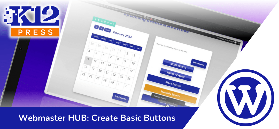
Start with a Section: Navigate to the section of your Divi site where you’d like to add a button. For this example, we’re adding a button next to the “More Events” button.
-
Add a Button Module: Click the gray plus sign to add a new module and select the “Button” module from the list.
-
Configure Button Text and Link: Enter the button text, such as “More Events.” In the link field, insert the URL where you want the button to link to. Use a hashtag (#) as a placeholder for demonstration purposes.
-
Design Your Button:
- Navigate to the design tab.
- Customize the button’s appearance. You can change the text color, background, add a gradient, and more.
- To mimic the “More Events” button’s look, you might add a gradient background, adjust the border radius for rounded corners, and apply a box shadow for depth.
-
Adjust Alignment: Align the button to the center or as desired within its section or column.
Using the Divi Text Module for Buttons:
-
Add a Text Module: Instead of a button module, add a text module where you want your button to appear.
-
Insert Text: Type the text for your button, like “More Events.”
-
Style Your Text as a Button:
- Access the design tab within the module settings.
- Set the text color, background color, and adjust the padding to create the button’s size.
- Apply a border and border radius to mimic a button’s appearance.
- Optionally, add a box shadow for depth.
-
Make It Clickable: Highlight the text and insert a link to make your text button functional. This can lead to any page or document on your site or an external URL.
-
Why Use Text for Buttons: This method offers more flexibility in sizing and responsiveness across devices. It’s particularly useful for creating full-width buttons that adjust dynamically to the content length.
Final Touches:
- Experiment with both methods to see which works best for your design needs.
- Remember, the Button module offers simplicity and quick setup, while the Text module provides more customization and flexibility, especially for responsive design.
- Save your favorite button styles to the Divi library for easy reuse across your site.


