
As mobile usage continues to soar, ensuring your school website is accessible and user-friendly across all devices is essential. Responsive design for school websites is no longer just an option; it’s a necessity for schools aiming to engage effectively with students, parents, and staff. This guide will walk you through the basics of implementing responsive design for school websites using the Divi Theme Builder on K12Press, highlighting practical tips and common challenges.
The Importance of Responsive Design for School Websites
Responsive design ensures that your school’s website adjusts seamlessly to fit the screen size of any device, enhancing usability and ensuring your site is accessible to everyone in your community. This adaptability improves user experience, boosts engagement, and is crucial for SEO.
Implementing Responsive Design for School Websites with Divi Theme Builder
1. Starting with Divi: Divi Theme Builder, utilized by K12Press, provides a robust foundation for creating responsive websites. It includes built-in settings for adjusting layouts based on device type—desktop, tablet, and mobile.
2. Granular Control Over Elements: Divi allows web designers to customize how each element behaves on different devices. For instance, you can specify different font sizes, spacing, or even hide certain elements that might not be necessary on smaller screens.
3. Utilizing Divi’s Visual Builder: The Divi Visual Builder feature offers a real-time preview for different devices. This tool is essential for understanding how adjustments will appear across devices and ensures that all changes contribute to a cohesive user experience.
Challenges in Responsive Design for School Websites
1. Forms and Images:
- Forms: Making forms mobile-friendly is crucial, as poorly optimized forms can deter users from completing them. Ensure all form elements are easy to interact with on touchscreens.
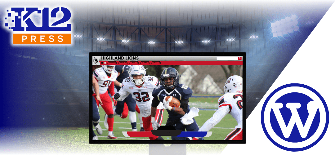
- Images: Responsive images should scale and adjust to fit the screen. Use K12Press content delivery networks (CDN) to serve optimized images that load quickly without sacrificing quality.
2. Navigation and Menus: Creating a responsive menu that works on small screens can be challenging. Use Divi’s collapsible menus and hamburger icons to make navigation intuitive on mobile devices.
Practical Tips for Enhancing Mobile Responsiveness
1. Test Regularly: Regular testing on various devices is critical. Use Divi’s responsive preview tools to check how your site looks and functions on different screens and make adjustments as needed.
2. Prioritize Simplicity: Keep your design simple and uncluttered. A minimalistic approach can significantly improve load times and usability on mobile devices.
3. Focus on Touch Interactions: Ensure all buttons, links, and form fields are easy to tap. Minimum recommended touch targets are 48×48 pixels.
4. Optimize for Speed: Mobile users expect fast load times. Optimize your site’s performance by compressing images, leveraging browser caching, and minimizing the use of large files.
Responsive design is key to making school websites accessible and effective across all devices. With K12Press and Divi Theme Builder, schools have the tools and flexibility to ensure their websites meet the high standards required in today’s digital landscape.
Explore more about responsive design and other features that enhance your school’s digital presence by visiting K12Press: Visit K12Press.